

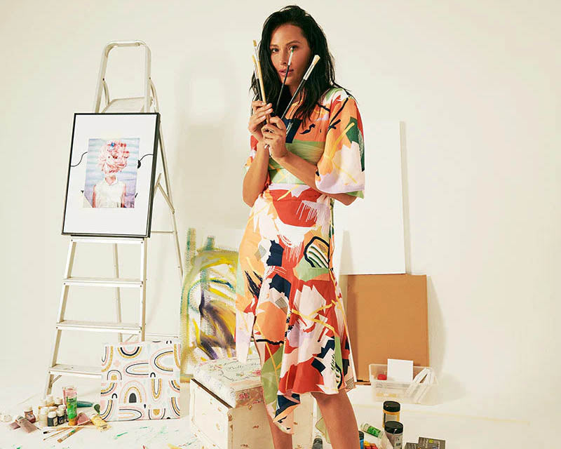
HOW COLOUR SPEAKS
Colour is often one of the first things we notice about a garment.
Before we understand the construction, fabric or detail, colour has already created an impression.
At L’MANE, it has always been an important part of our visual language sometimes expressive and immediate, sometimes restrained and revealed only through a small detail.
But we don't believe a colour has to mean one particular thing.

COLOUR IS PERSONAL
The same colour can create completely different responses in different people.
A vivid shade that feels energising to one woman may simply remind another of a place, a memory or something she has always been drawn to.
A dark palette can feel dramatic, quiet or sophisticated depending on the person experiencing it.
That subjectivity is what makes colour interesting.
Rather than deciding what a woman should feel when she wears a particular shade, we use colour to create atmosphere, contrast and visual tension leaving the interpretation open to her.

WHEN COLOUR BECOMES ARTWORK
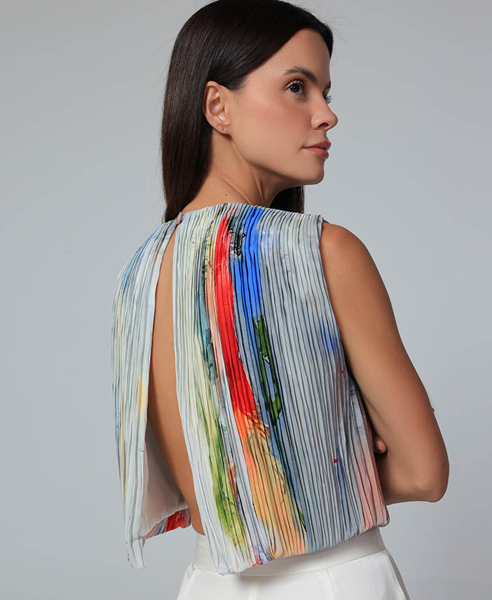
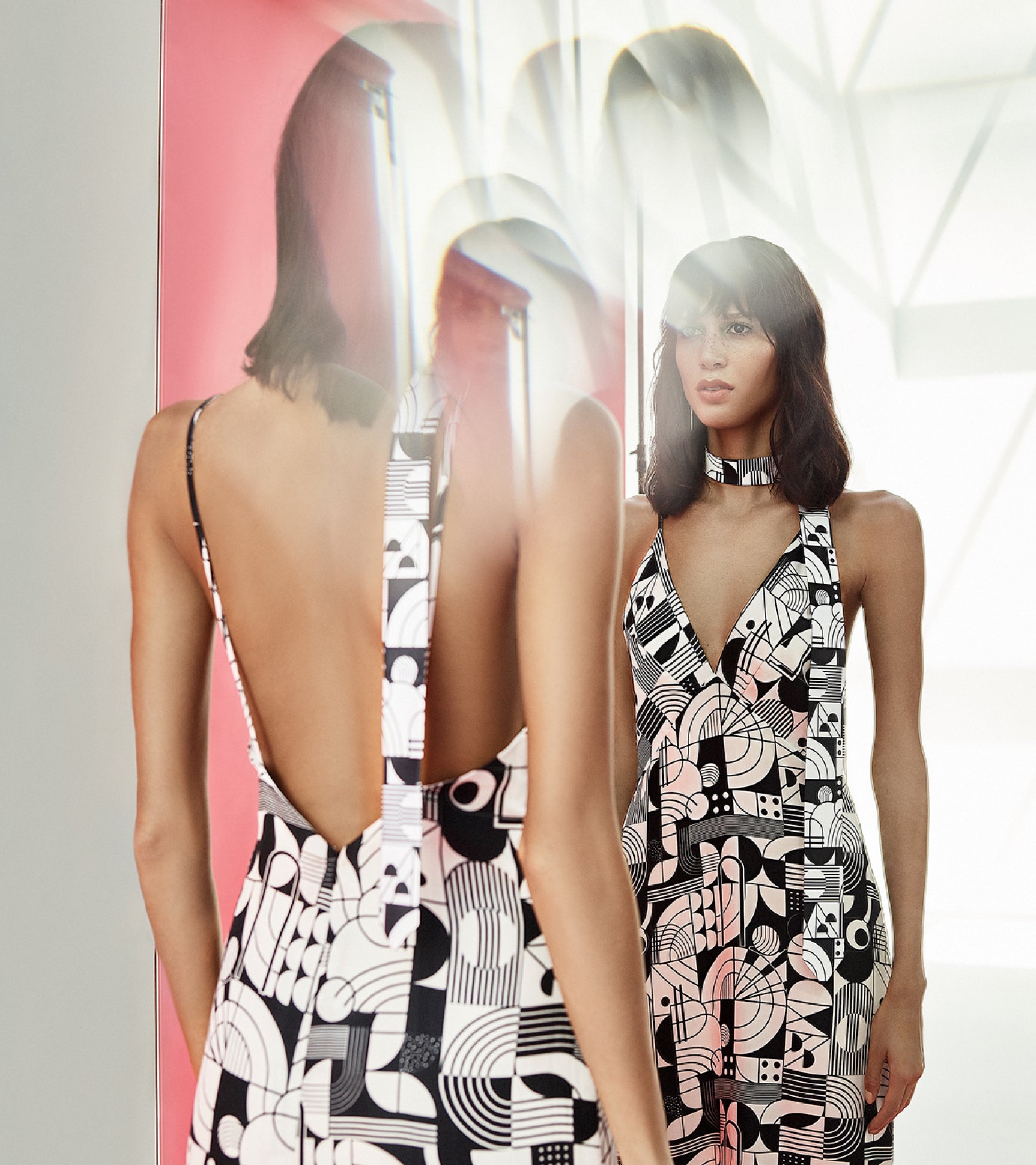
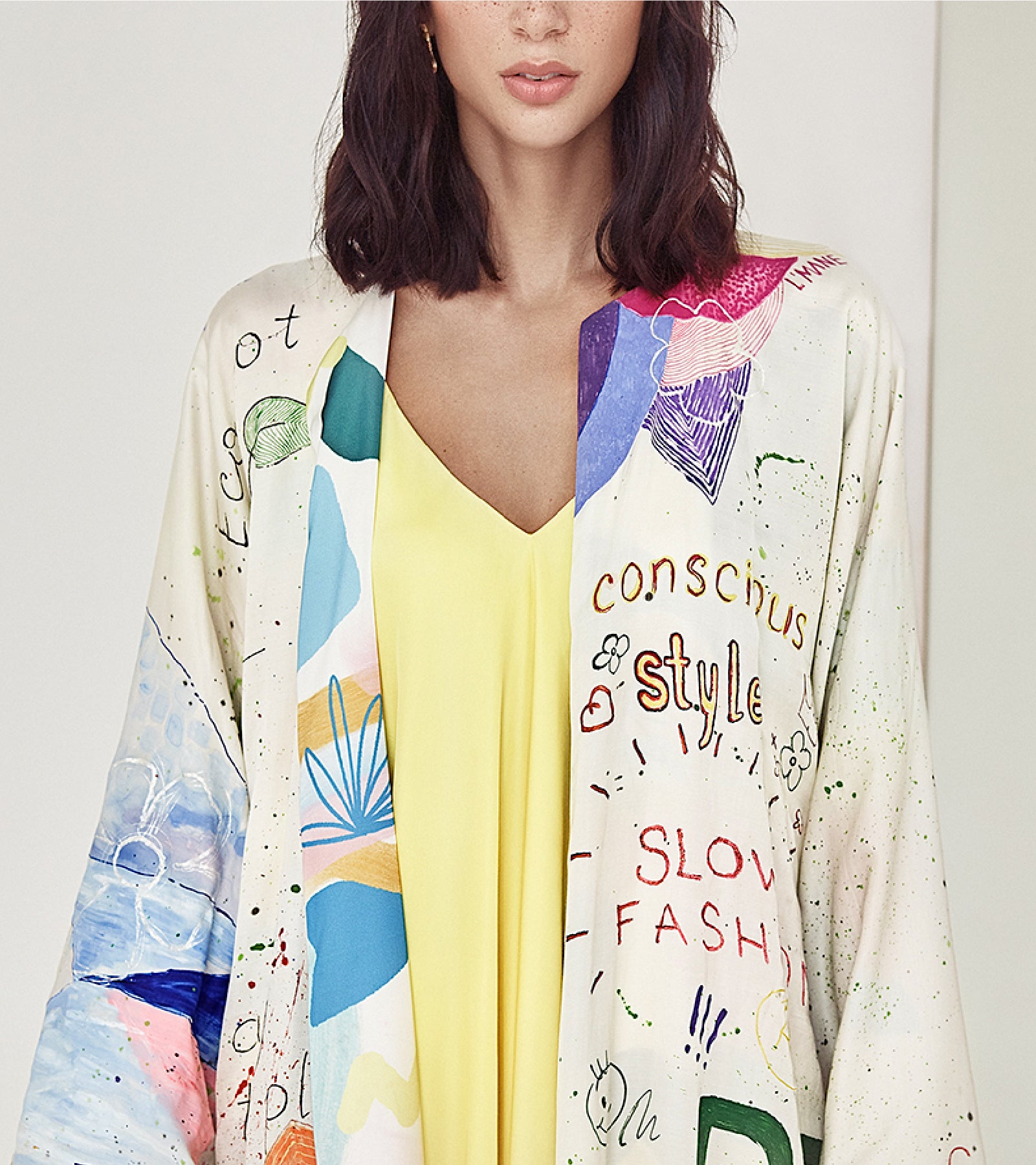
Colour becomes particularly expressive through L’MANE's original abstract prints.
Here, individual shades rarely exist alone.
They overlap, interrupt one another and move across the artwork. Once translated onto fabric, those relationships change again.
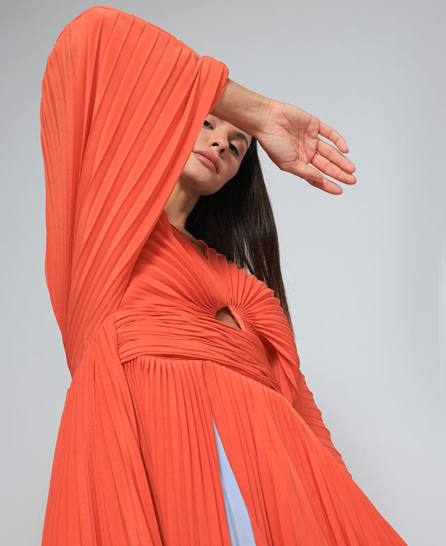
Pleating can hide one colour while revealing another. Draping can bring previously separate areas together. Movement can completely alter which part of the composition takes focus.
The result is colour that is experienced differently depending on how the garment is viewed and worn.
EXPRESSION AND RESTRAINT
Our relationship with colour has continued to evolve.
Bold colour and expressive artwork remain part of L’MANE, but we are equally interested in what happens when colour is used with restraint.
A largely neutral silhouette can make one unexpected shade more significant. A contrasting colour can appear inside a pleat rather than across the entire garment. Artwork can be partially concealed beneath a layer and discovered only through movement.
Sometimes the smallest amount of colour creates the strongest interruption.
COLOUR WITHIN THE FORM
Colour is never considered entirely separately from the garment.
We look at how it interacts with proportion, fabric, artwork and construction.
A shade can emphasise an architectural line, divide a silhouette, soften a structured form or draw attention to a detail that might otherwise remain unnoticed.
This is where colour becomes more than a palette decision.
It becomes part of the construction of the visual idea.
NO FIXED MEANING
We can choose the colours. We can decide where they appear and how they interact.
But once the garment is worn, the response belongs to someone else.
That is something we prefer not to define.
At L’MANE, colour doesn't tell a woman how to feel. It gives her something to interpret for herself.